fig. B01 — brand identity · 14 boards
Swarniq
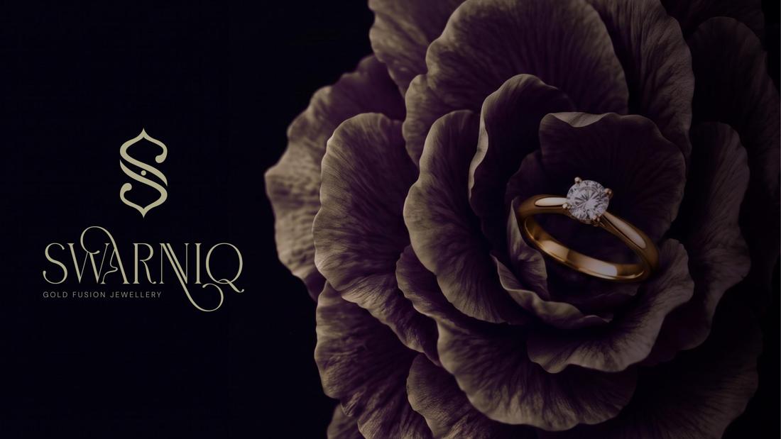
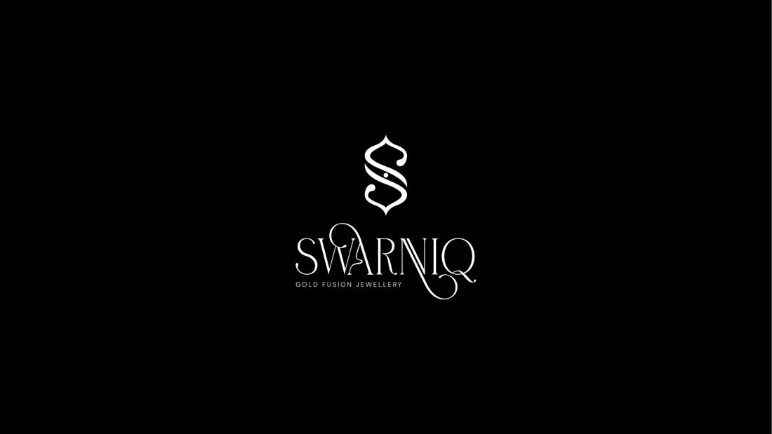
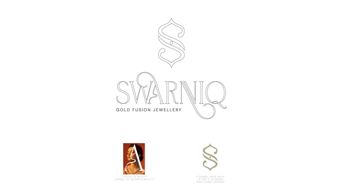
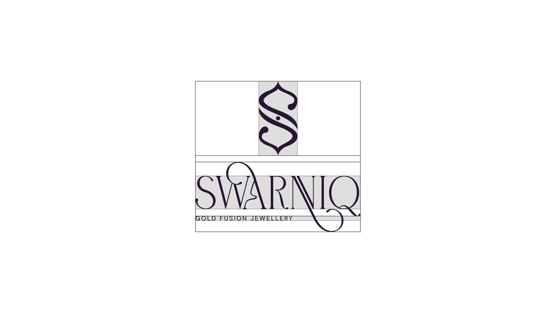
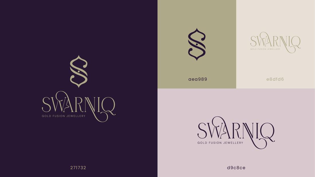
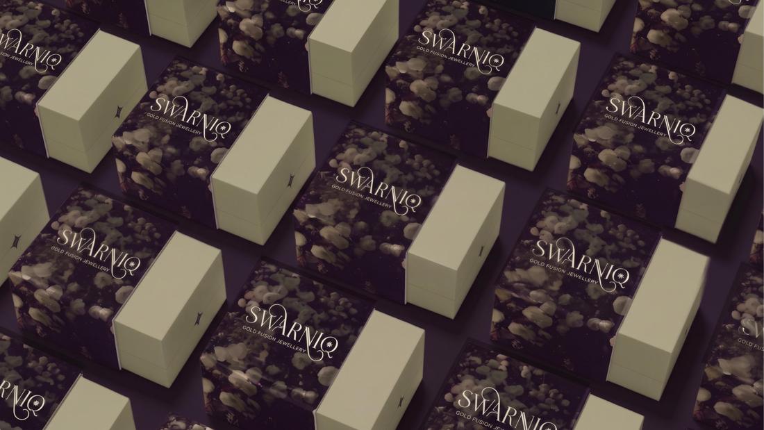
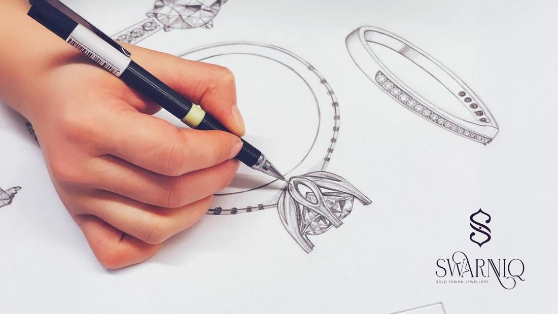
JewelleryA refined gold marque and brand world crafted for a jewellery house — built to feel precious in print, on screen, on packaging and above the store door.
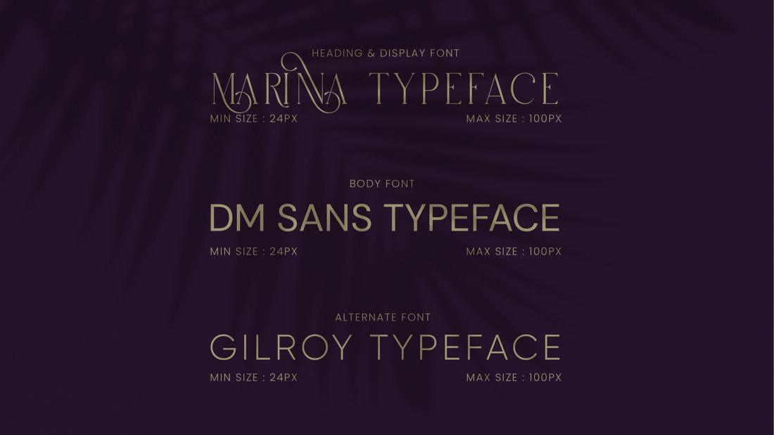
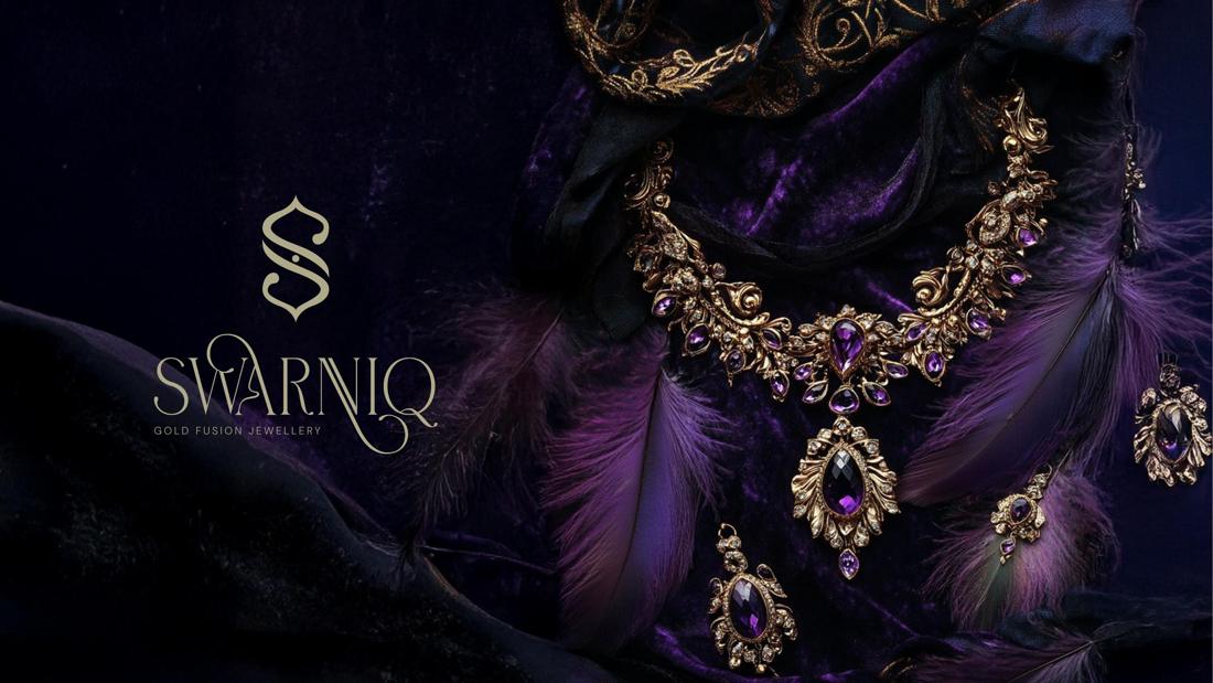
We create distinctive visual identities that bring together strategy, personality and design. From logos and colours to typography and brand language, every element is developed to tell one consistent story. Open any project to see the complete identity — concept, palette, typography and real-world applications.
A refined gold marque and brand world crafted for a jewellery house — built to feel precious in print, on screen, on packaging and above the store door.
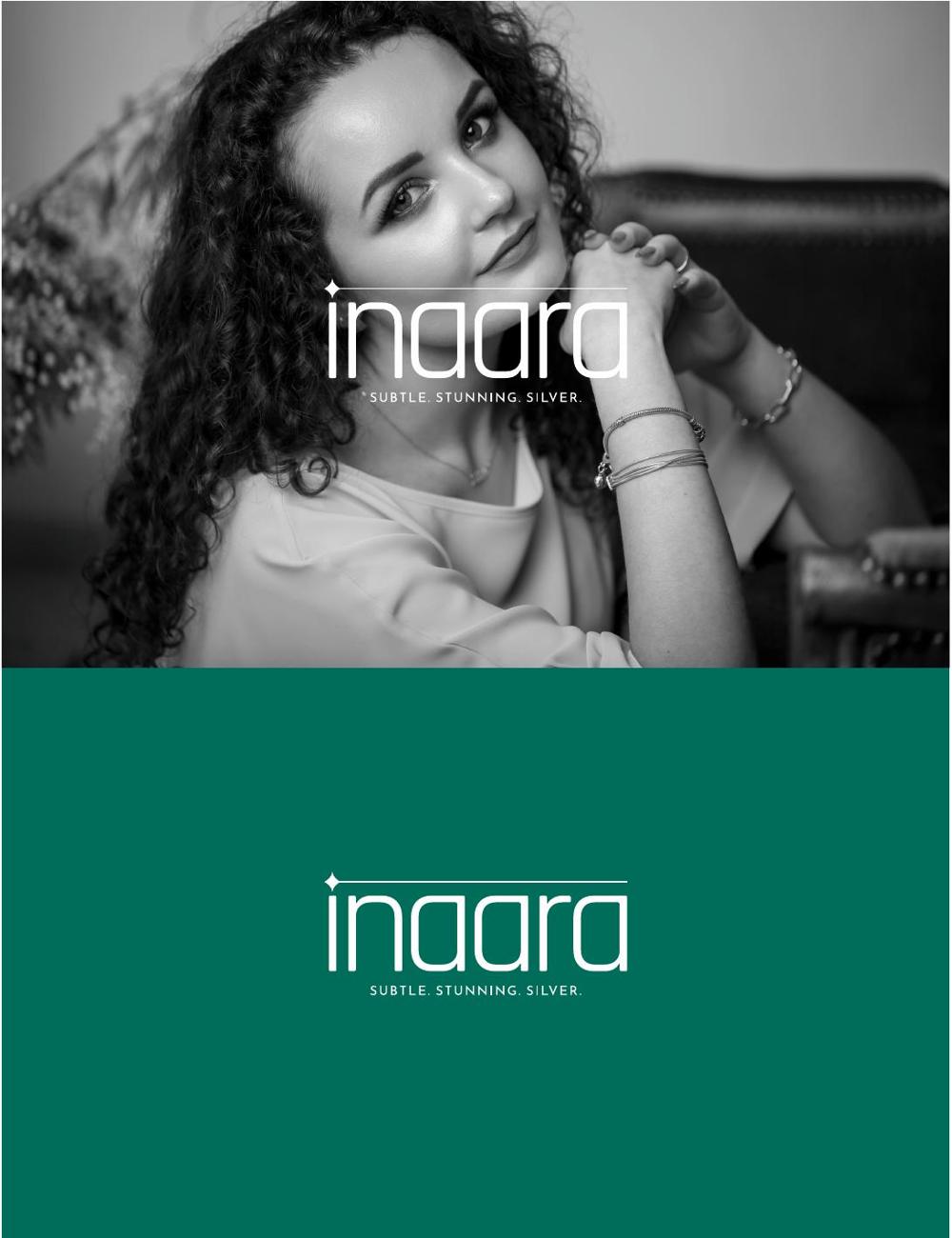
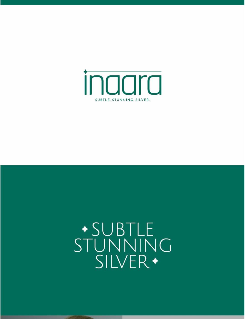
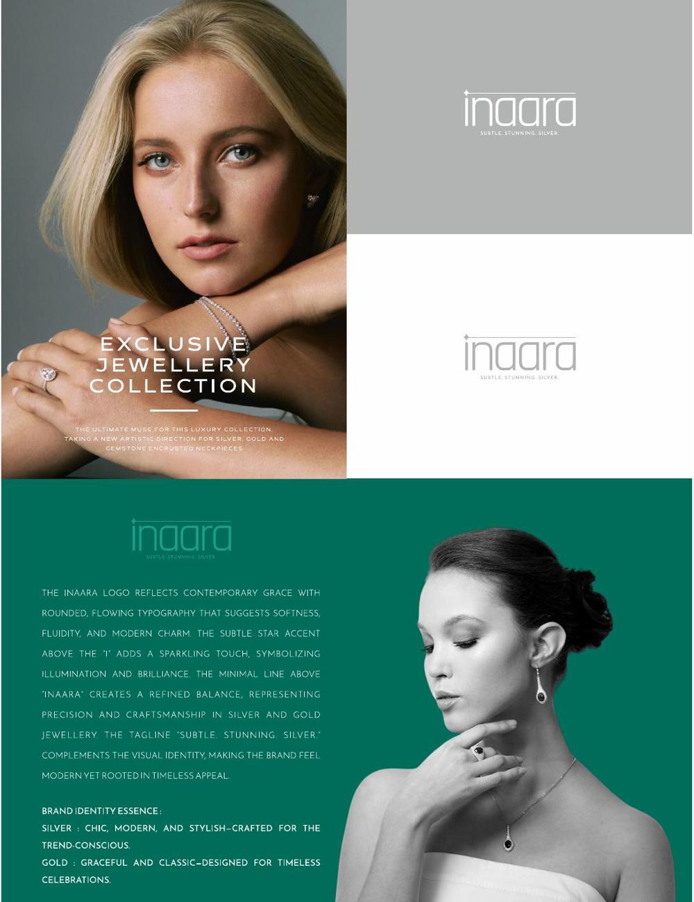
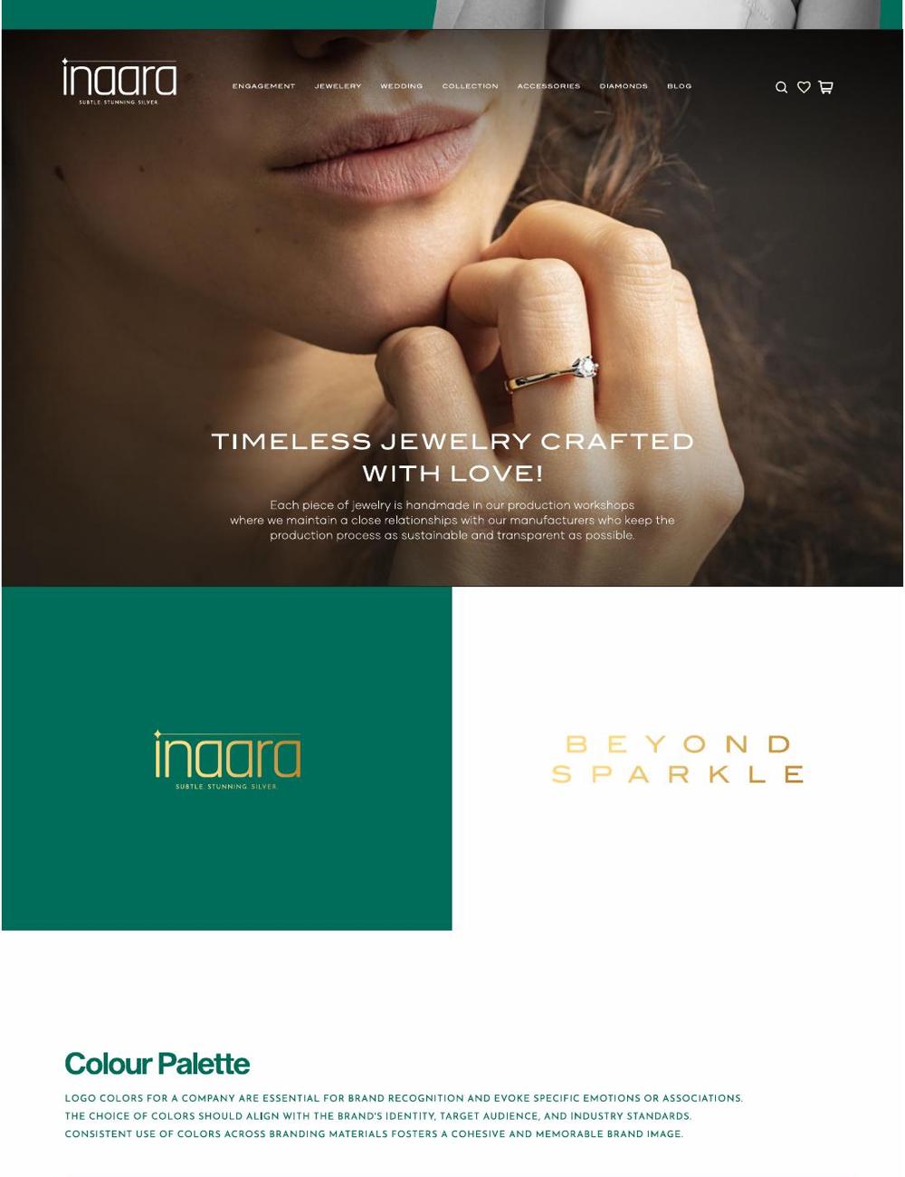
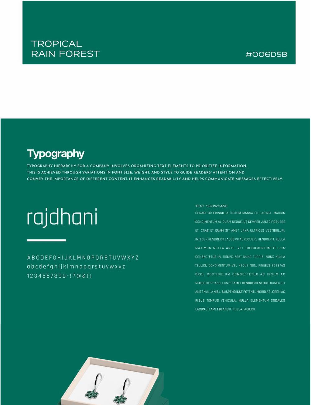
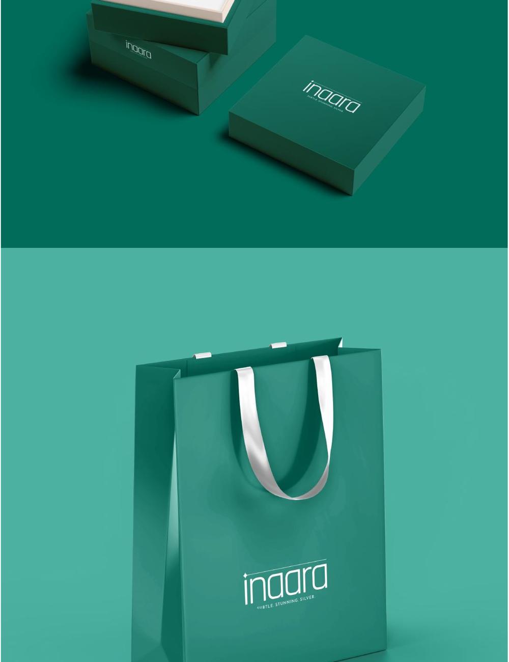
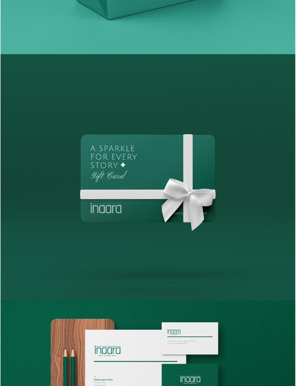
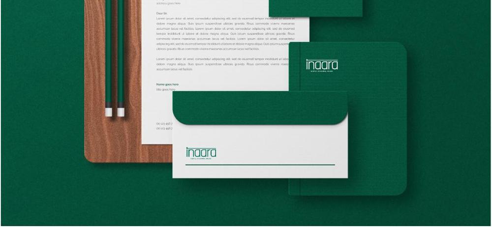
Subtle. Stunning. Silver. A complete identity in a tropical rain-forest green — logotype, packaging, gift cards and stationery designed to take silver jewellery beyond sparkle.
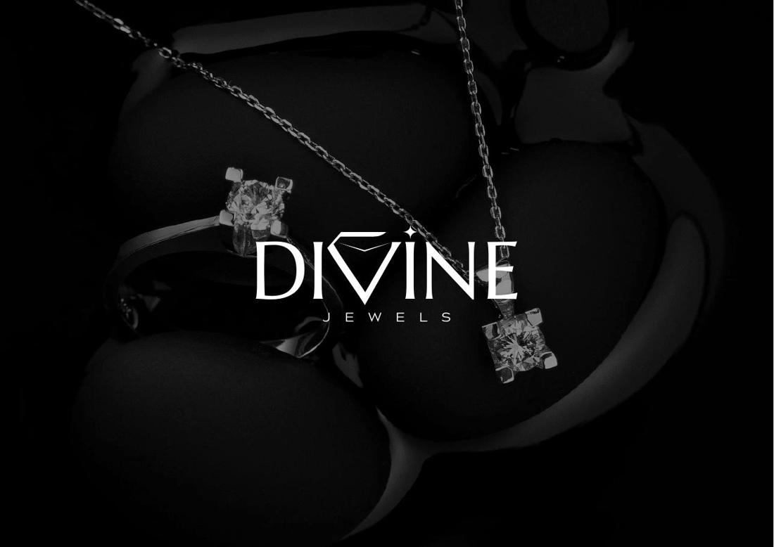
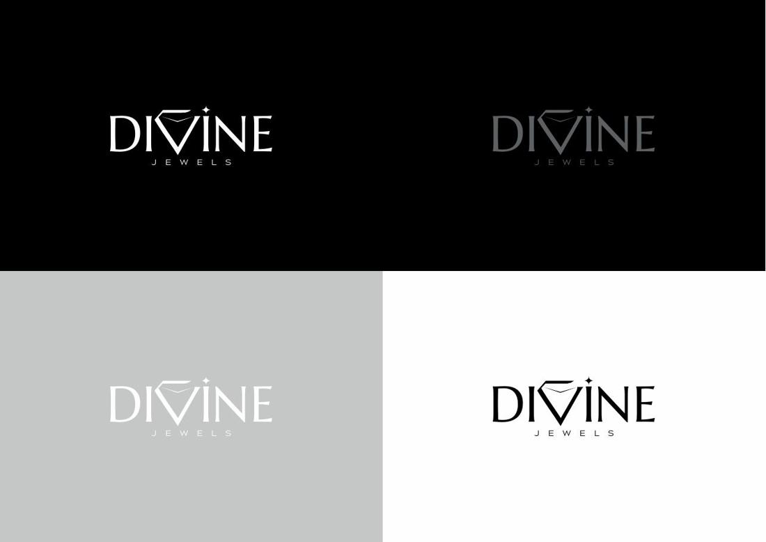
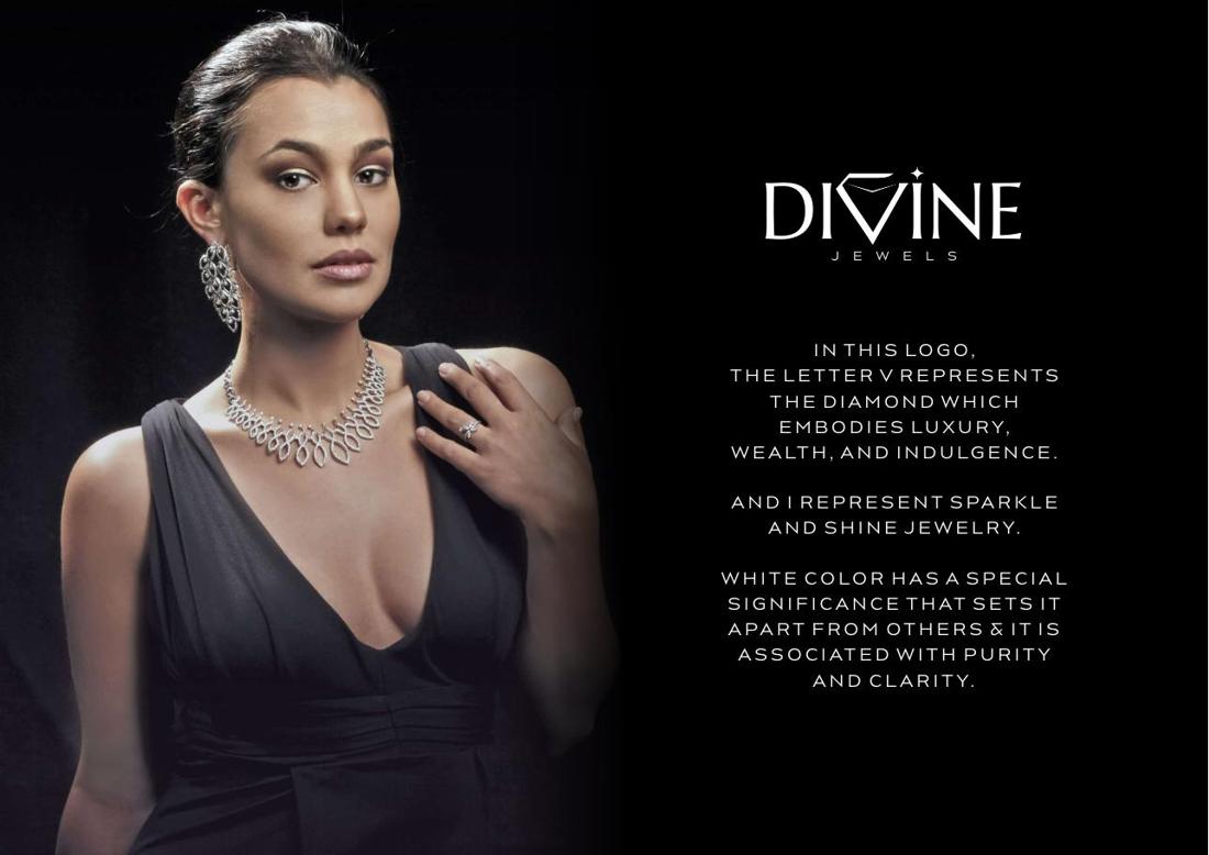
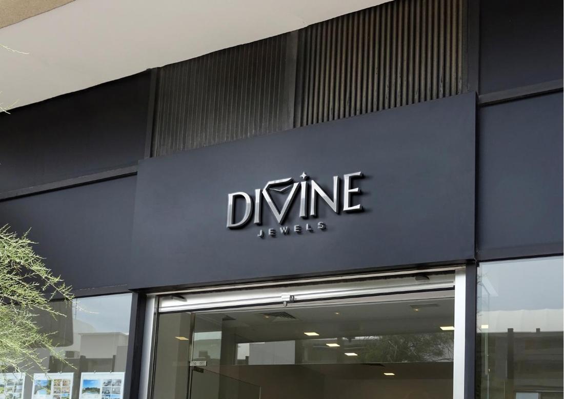
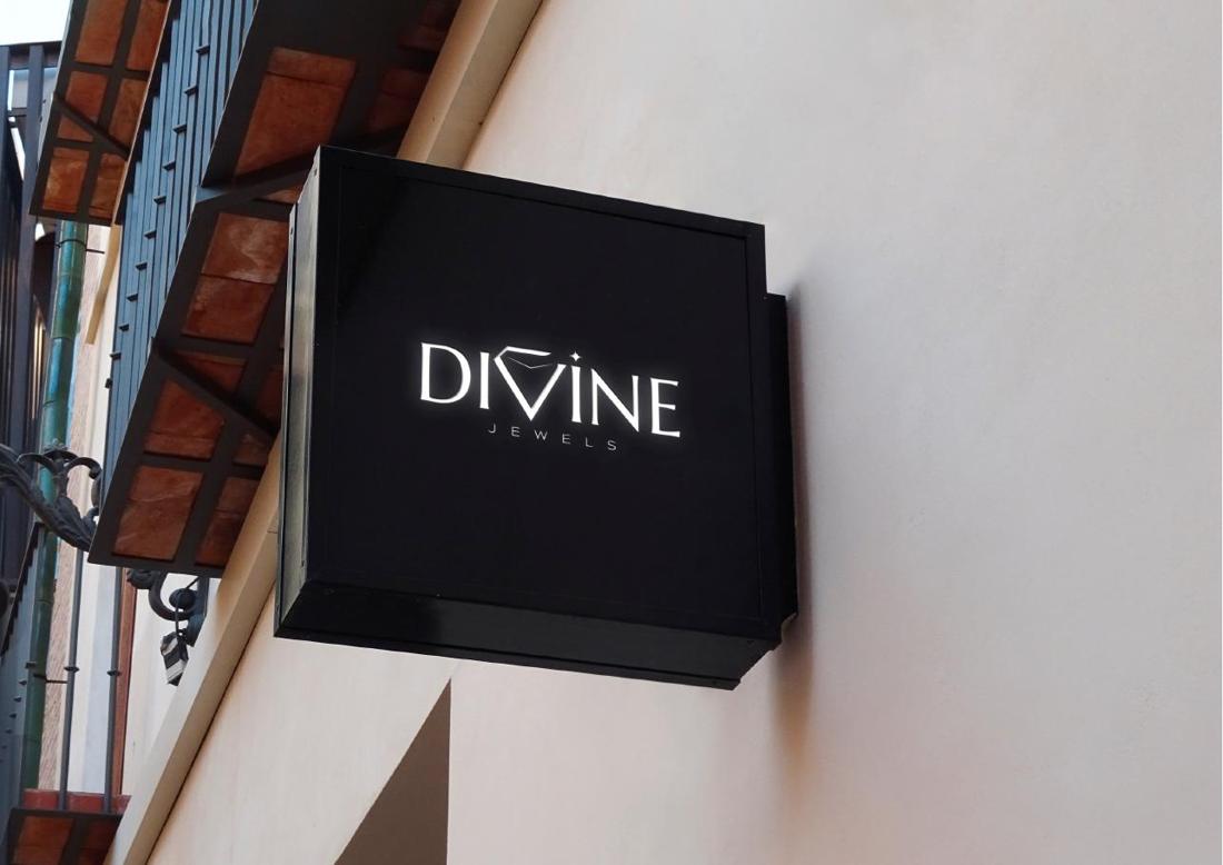
The V becomes a diamond, the I becomes the sparkle. A monochrome identity built on purity and clarity — extended into illuminated storefront signage.
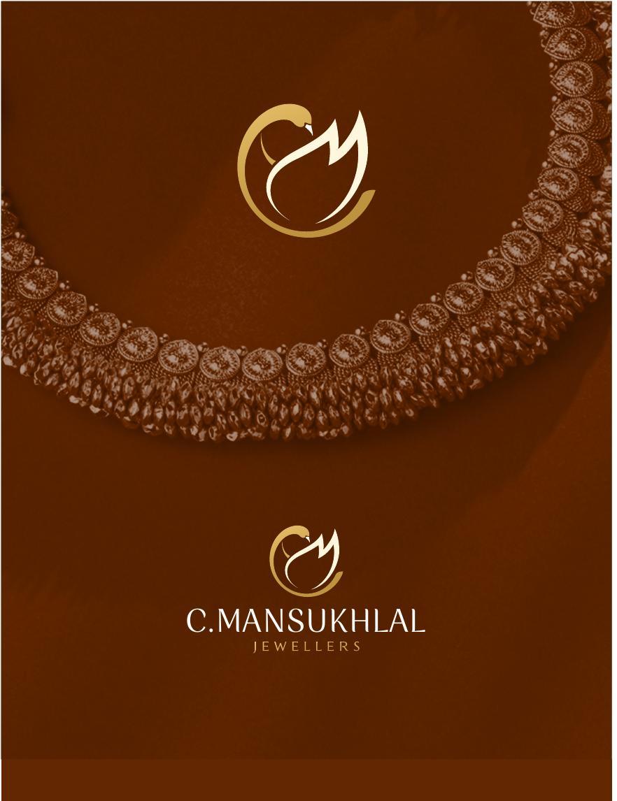
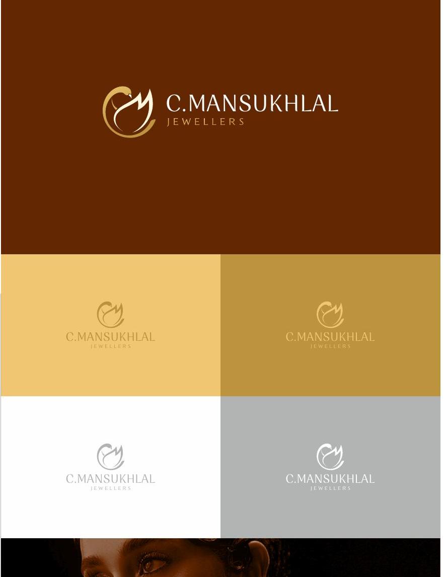
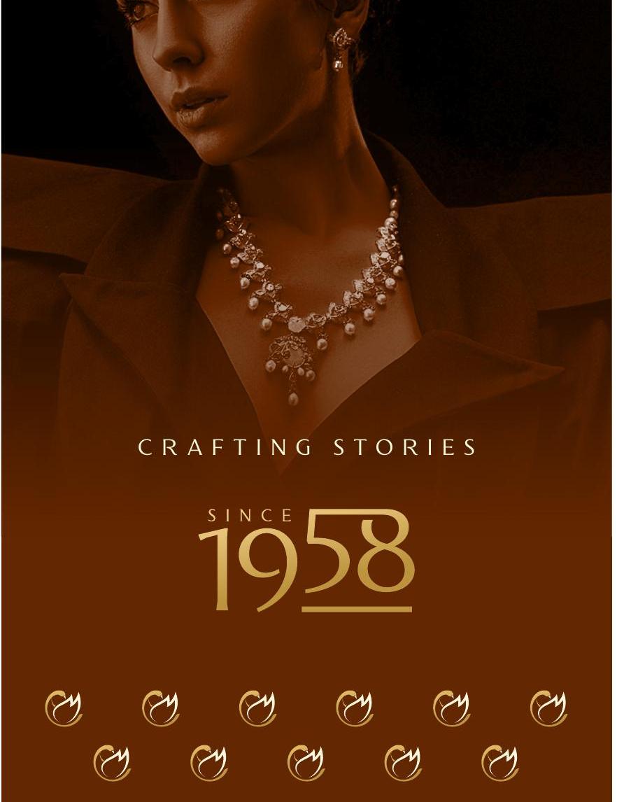
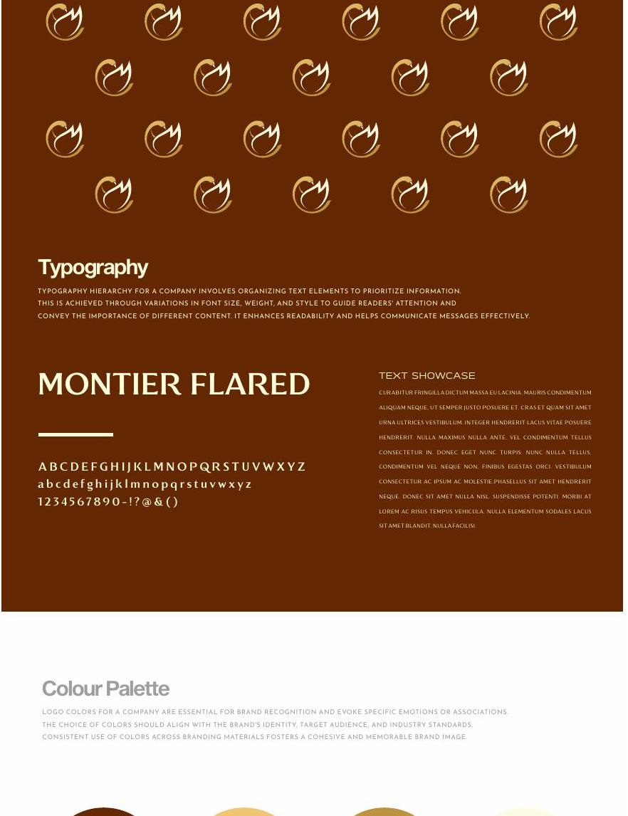
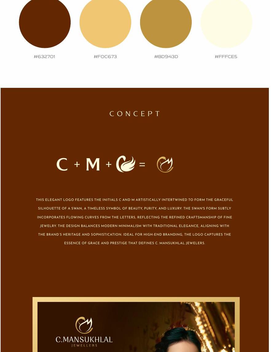
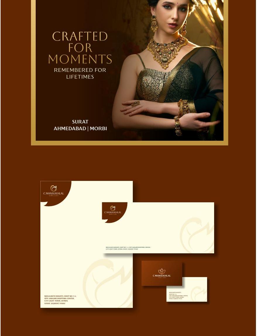
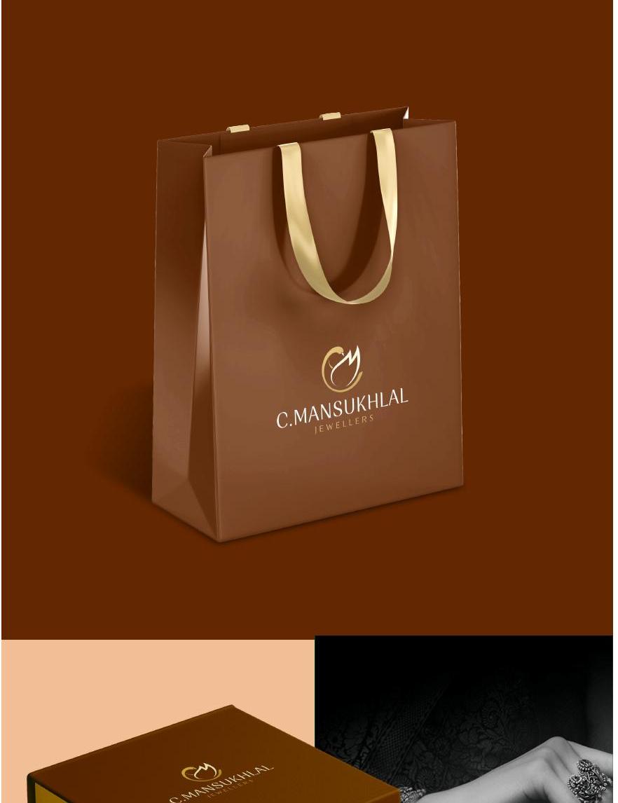
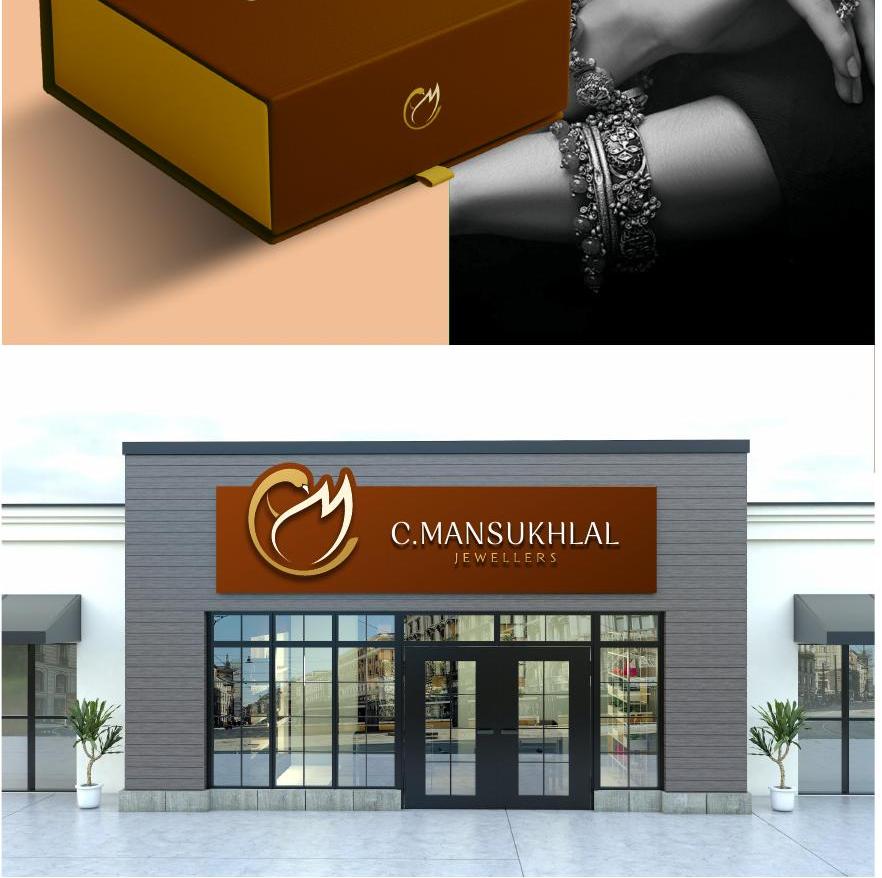
The initials C and M intertwined into the silhouette of a swan — beauty, purity and luxury for a house crafting stories since 1958. A rich brown and gold world with flared serif typography.
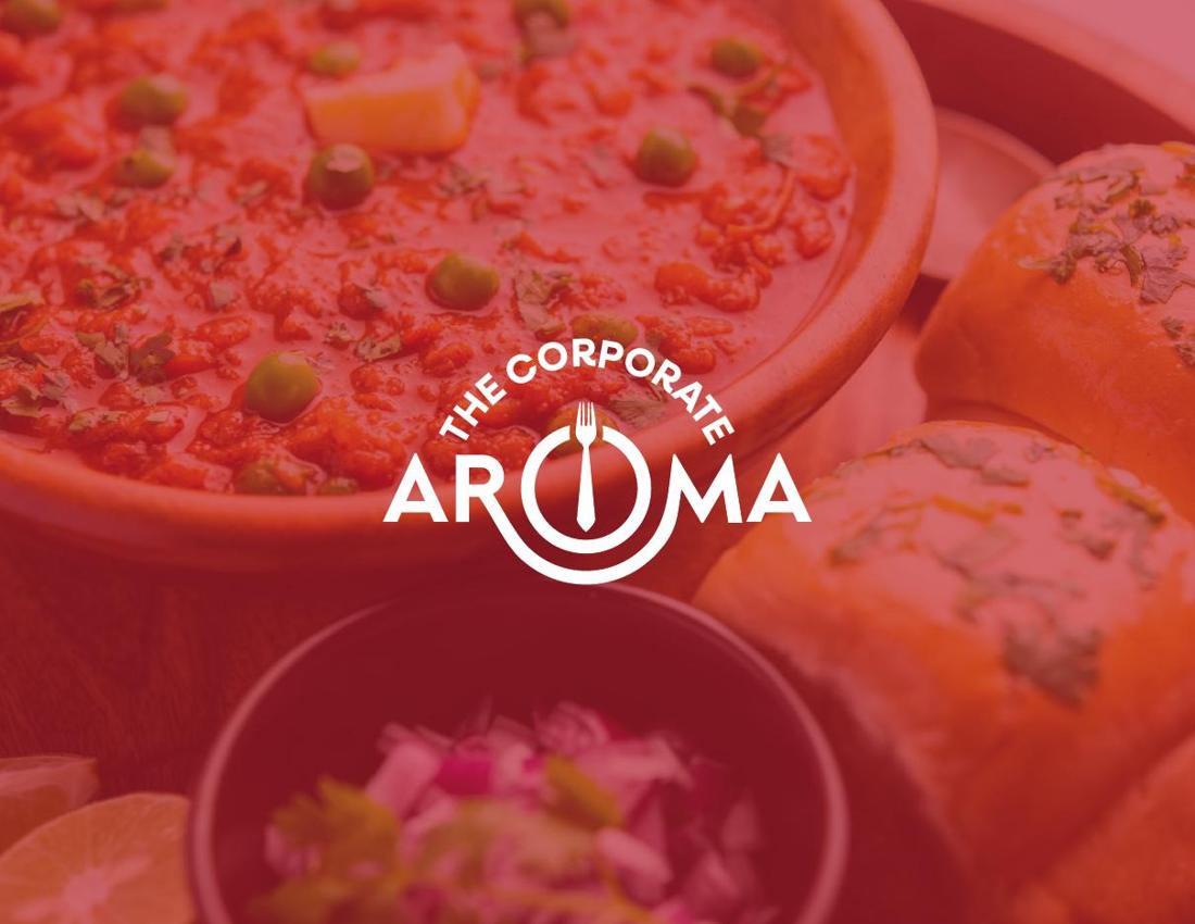
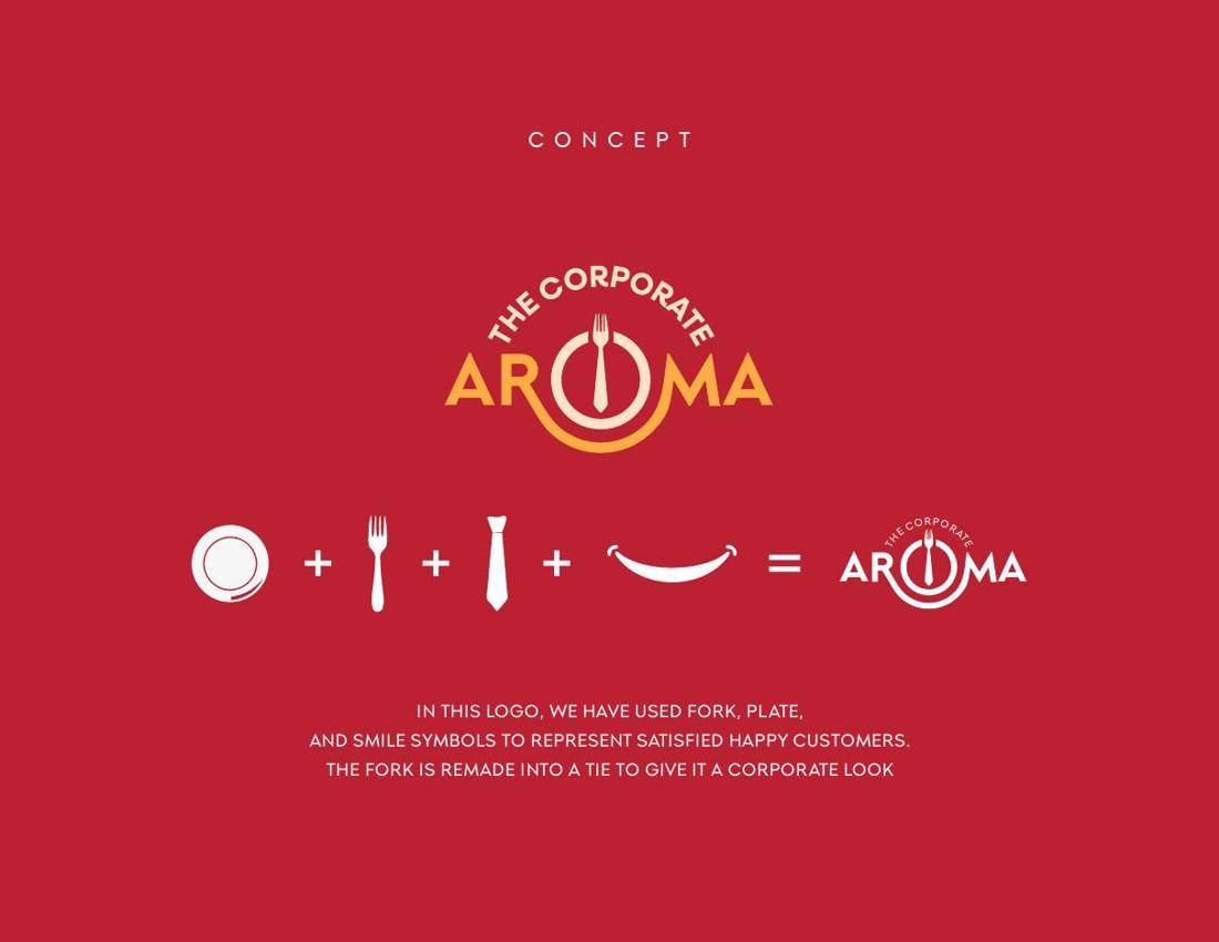
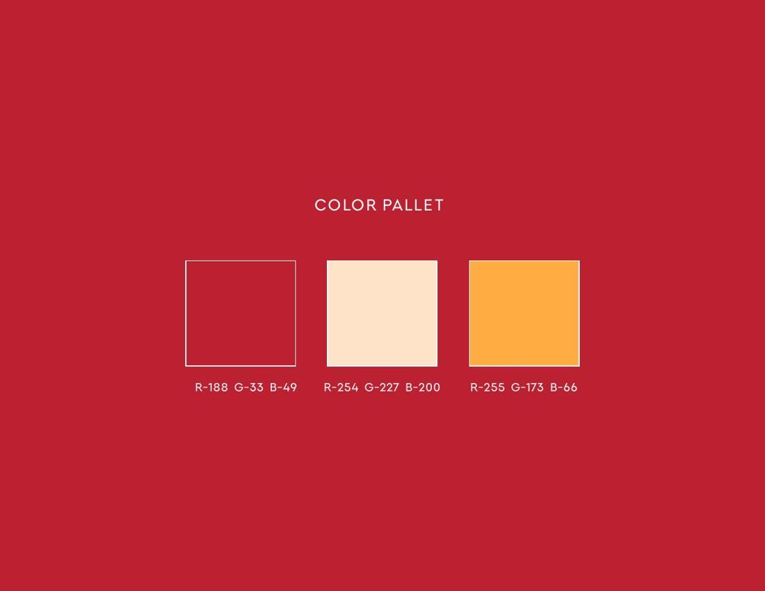
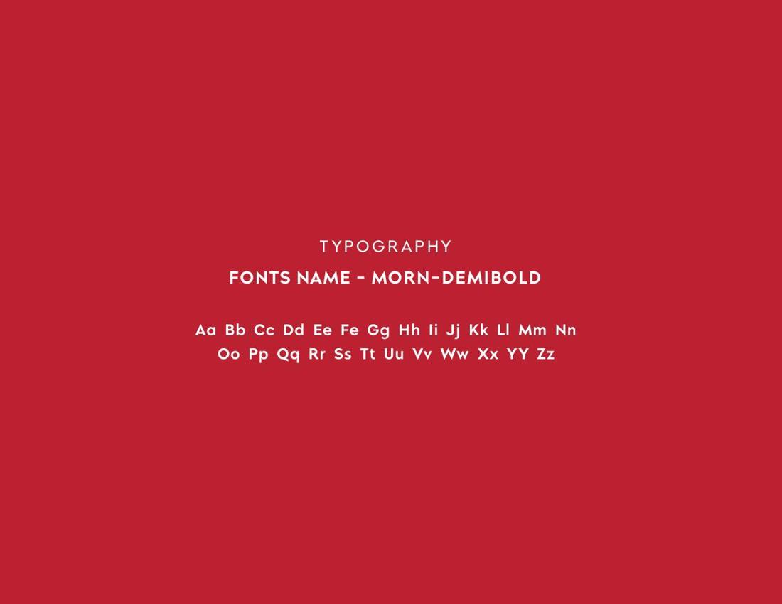
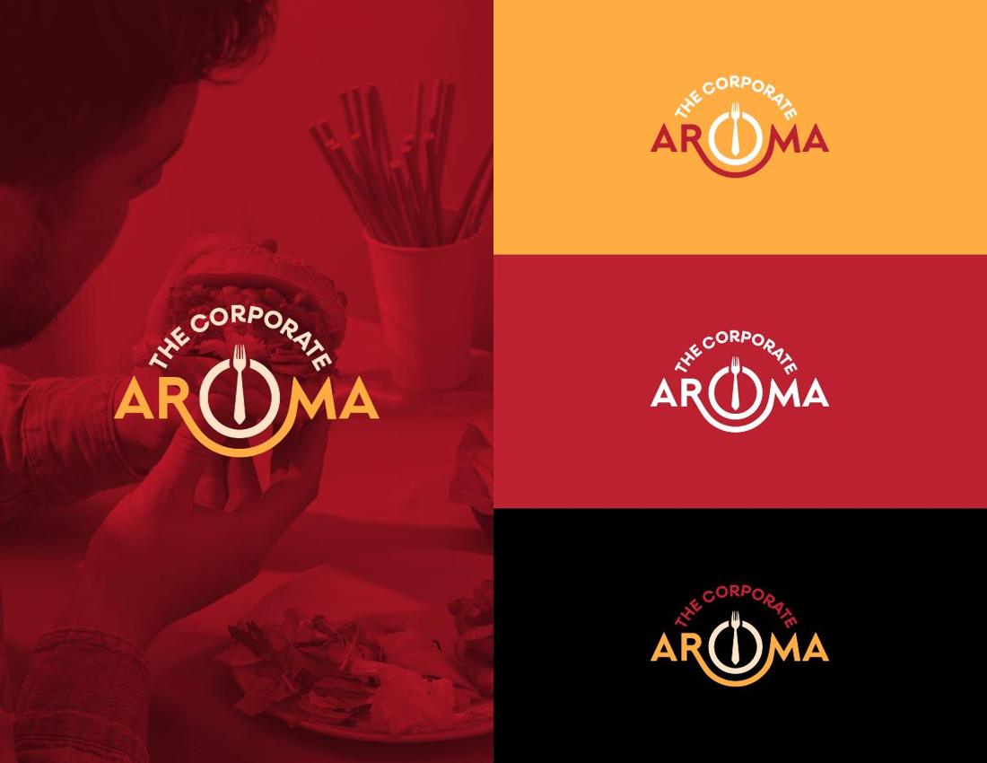
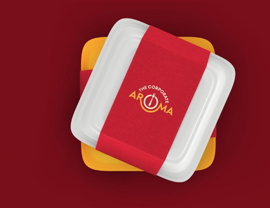
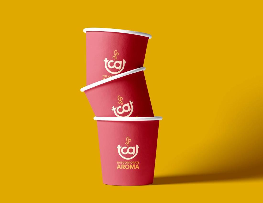
A fork, a plate and a smile combined into one mark — with the fork remade into a tie to give the identity its corporate character. A warm red, amber and cream palette built for appetite and approachability.
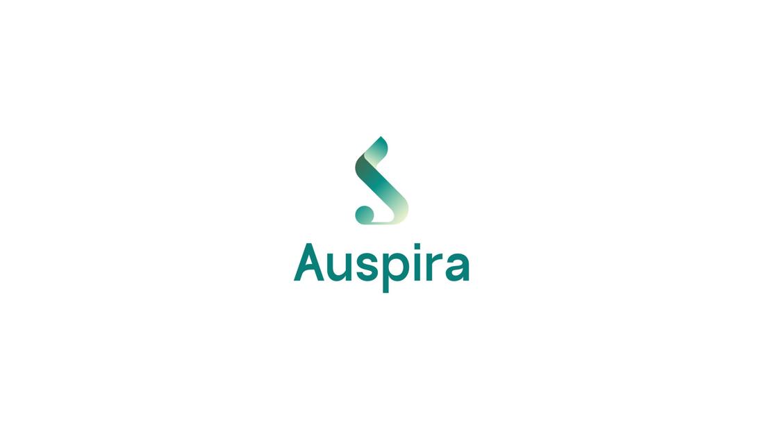
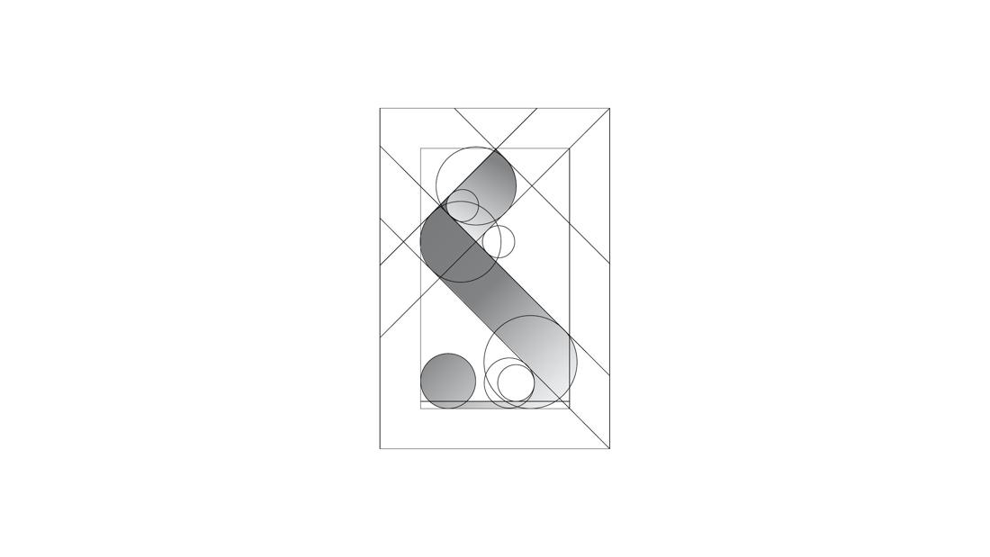
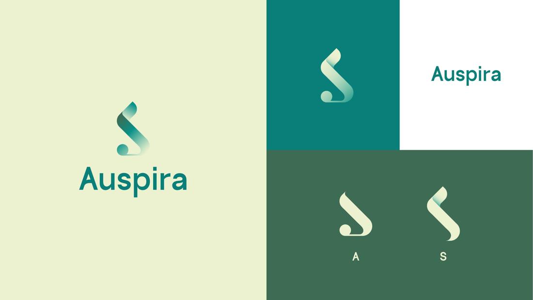
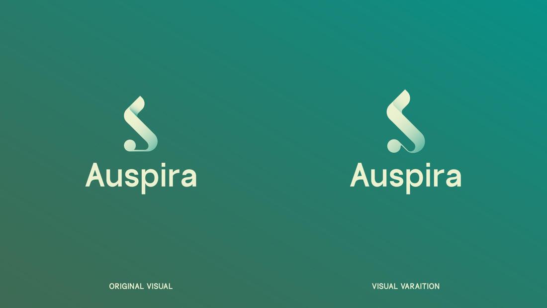
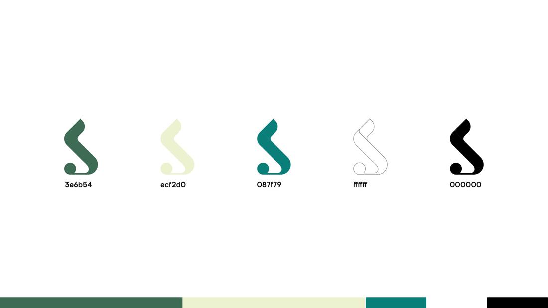
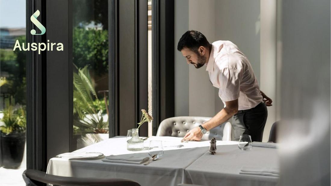
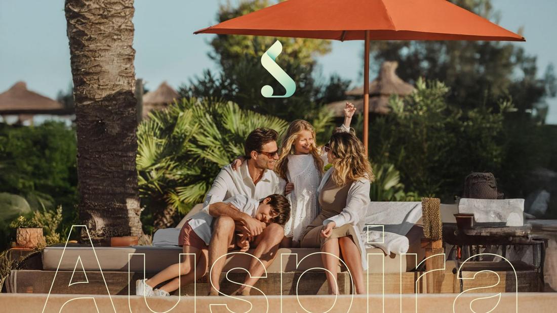
The letters A and S fused into a single fluid monogram representing a guest's journey from arrival to a memorable stay. A deep teal to soft mint gradient carries trust on one end and freshness on the other.

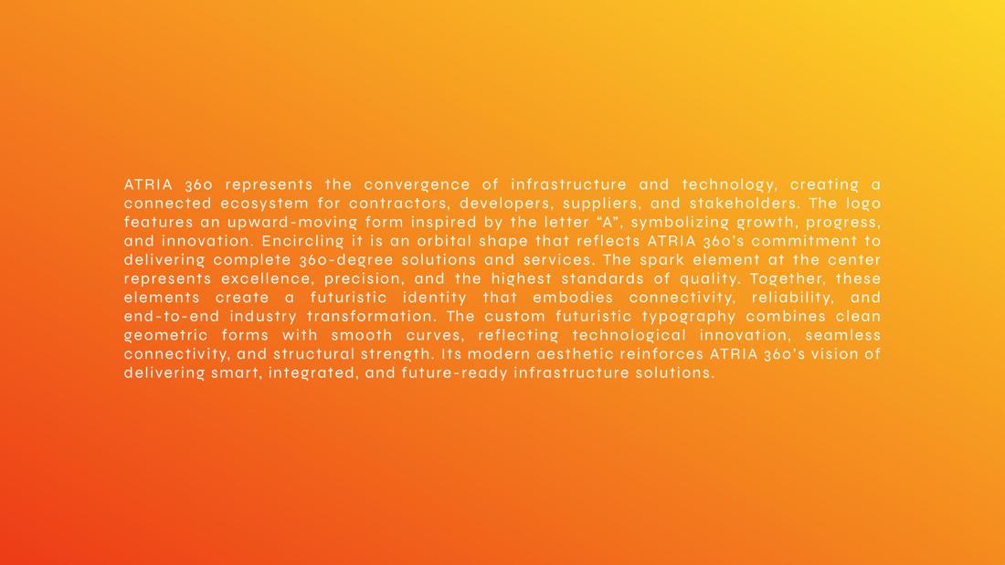
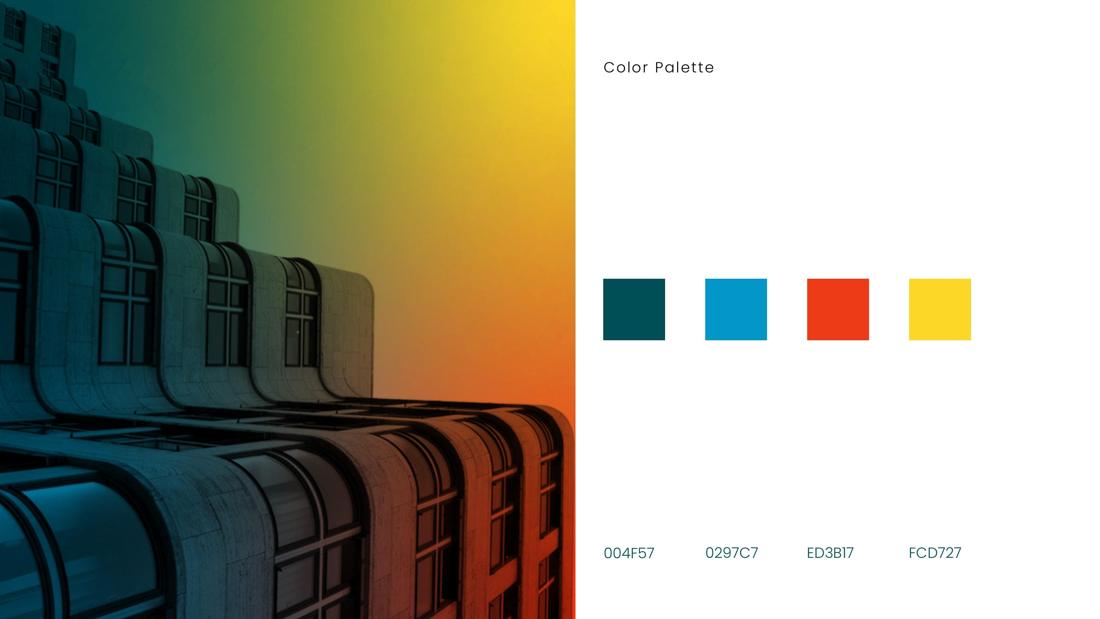
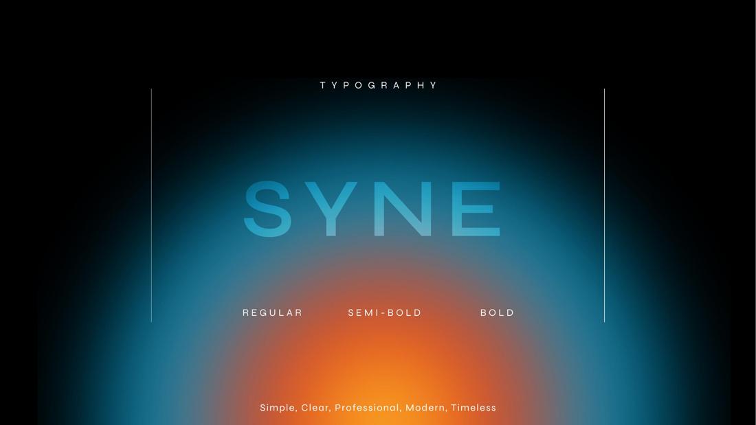
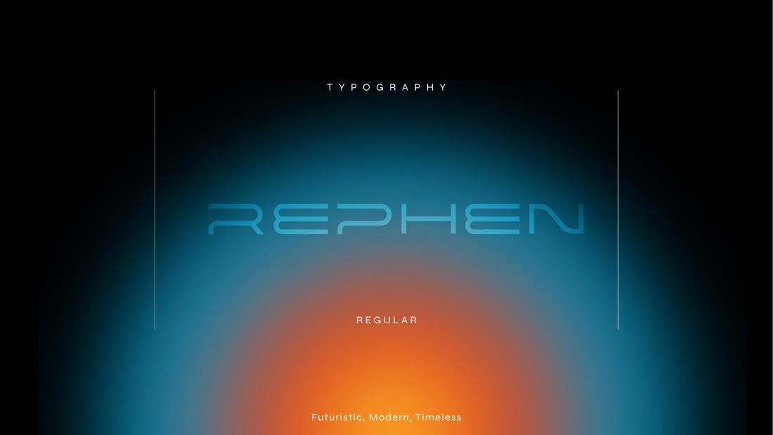
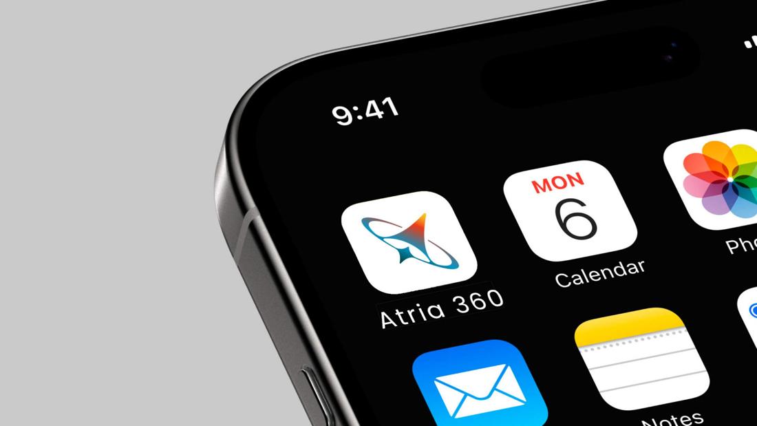
An upward-moving A wrapped in an orbital ring with a spark at its centre — growth, 360-degree solutions and precision for a connected infrastructure ecosystem. Futuristic custom typography completes the system.






The letter M, a sacred lotus and an upward arrow woven into one marque — beauty, prosperity and growth for a designer studio, carried across tags, bags and brand touchpoints.
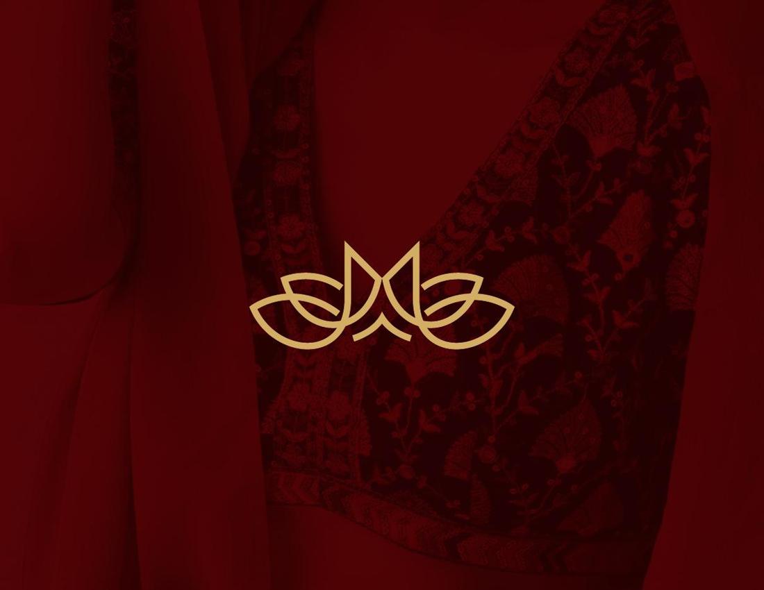
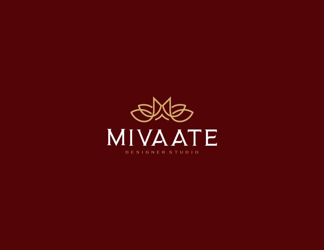
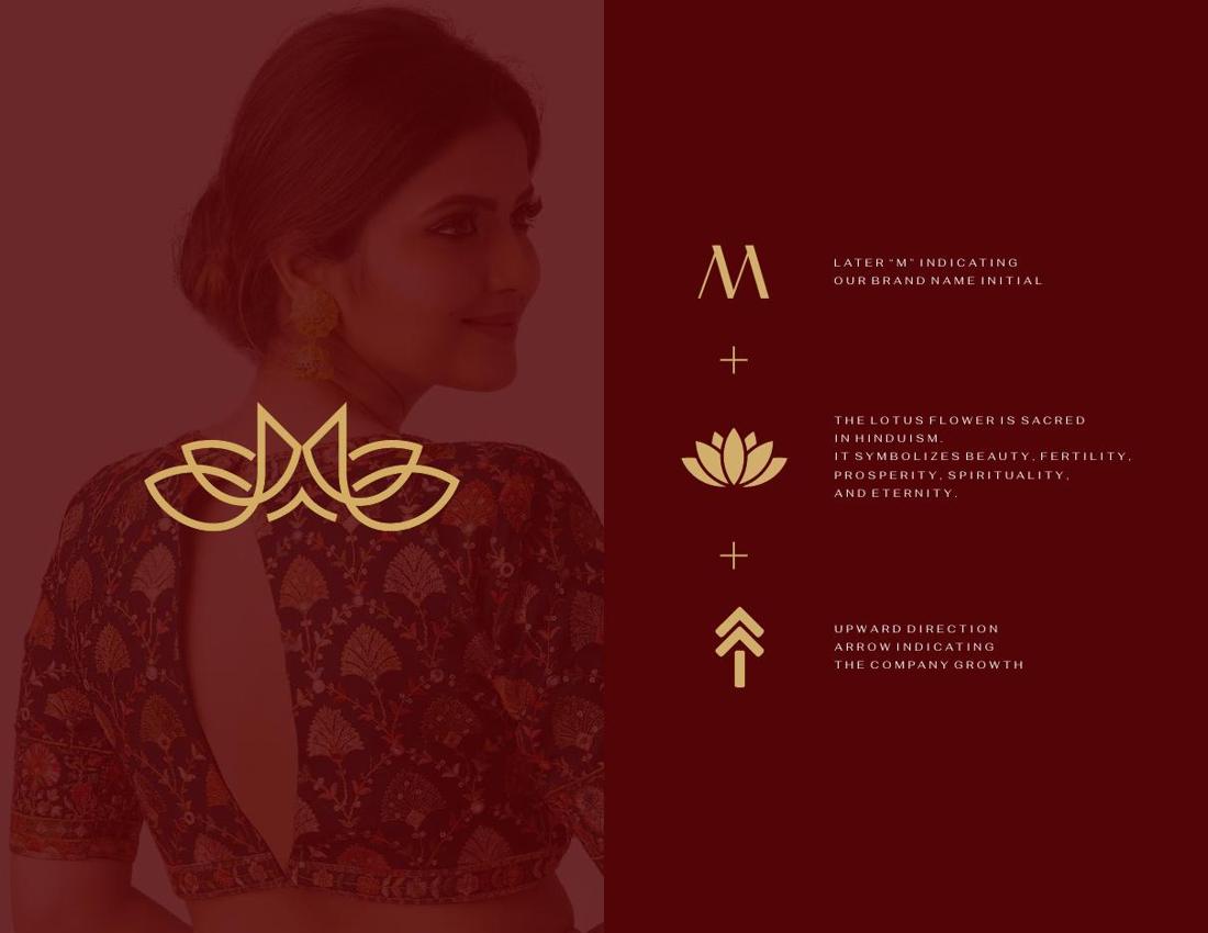
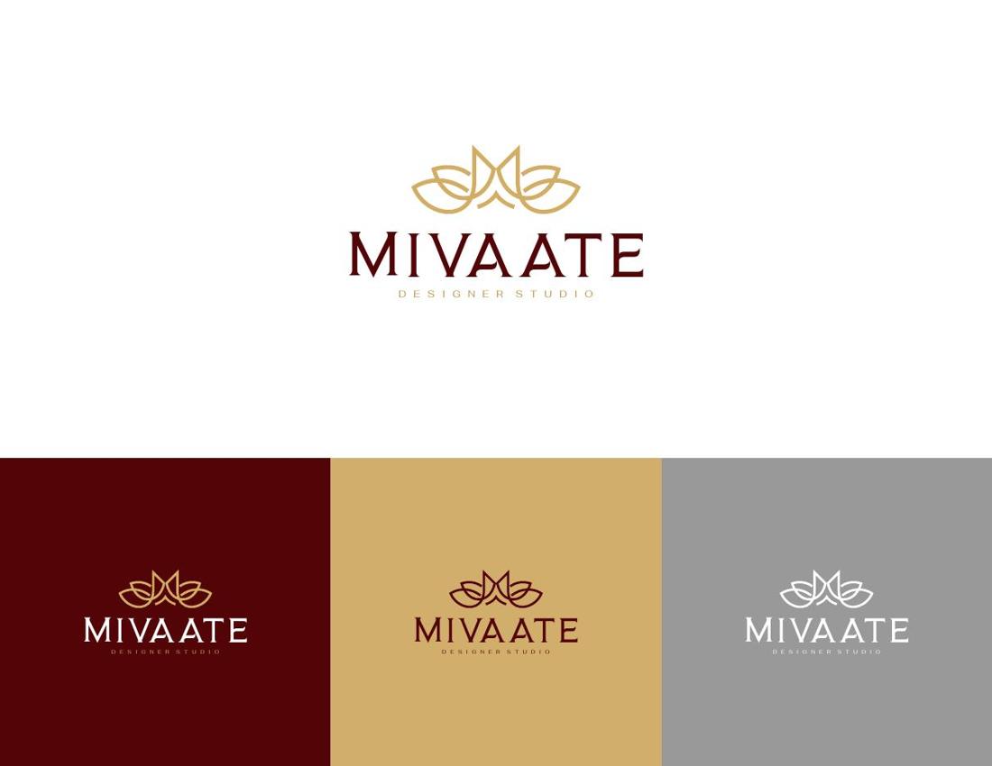
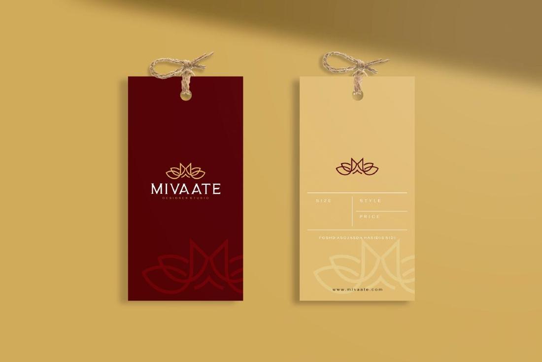
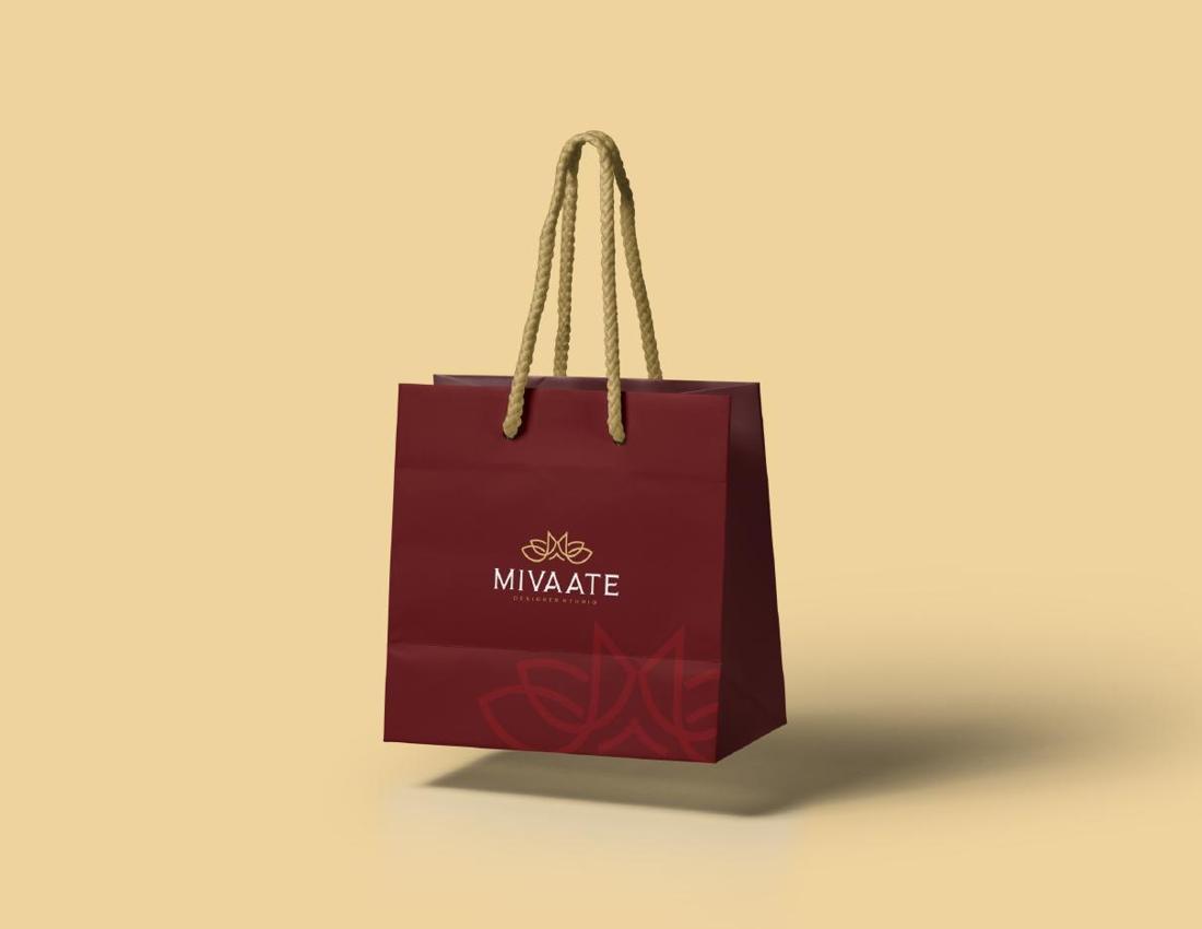
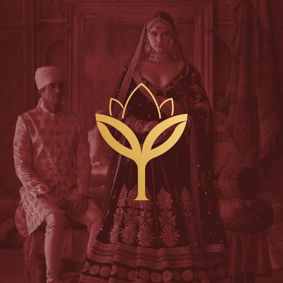
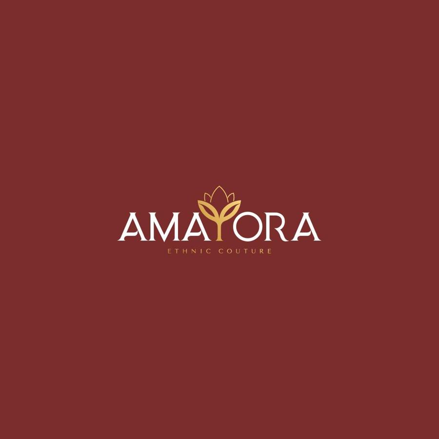
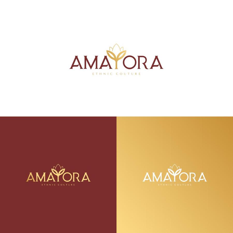
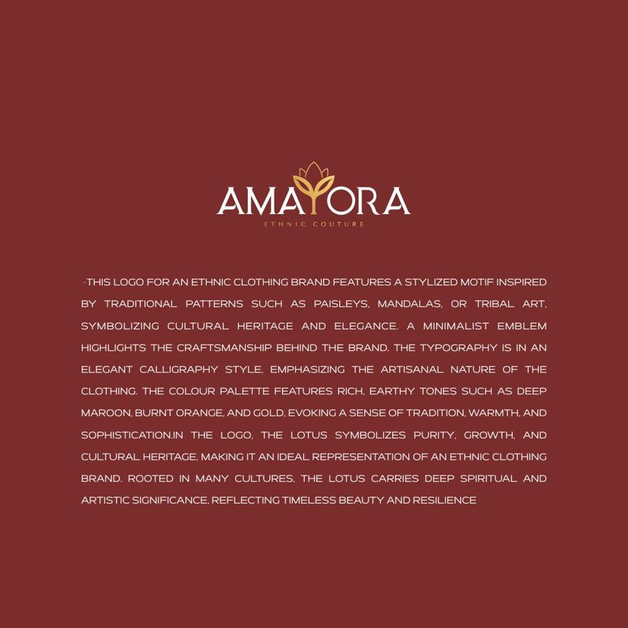
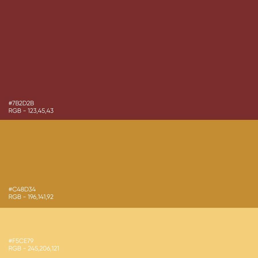
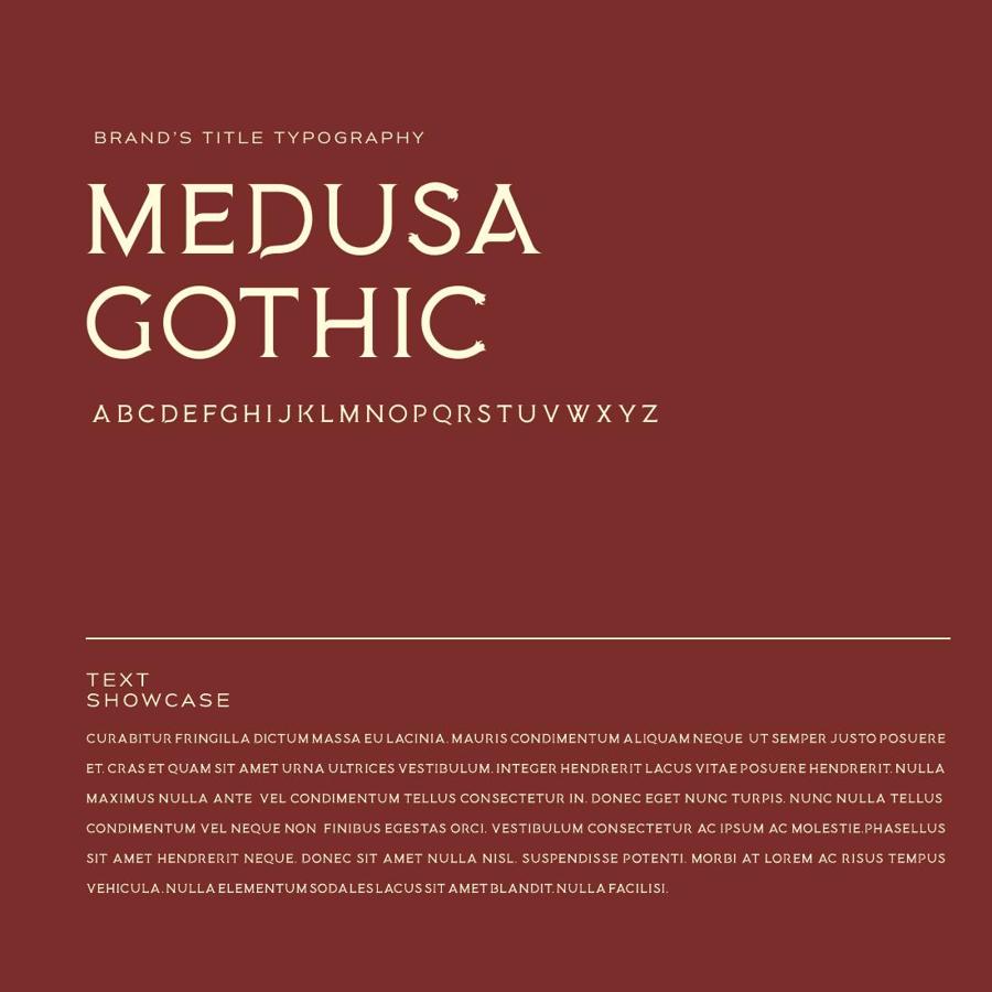
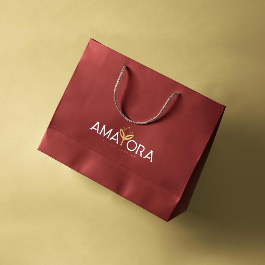
A lotus-crowned wordmark in deep maroon and gold — cultural heritage rendered with couture restraint, from the marque to the shopping bag.
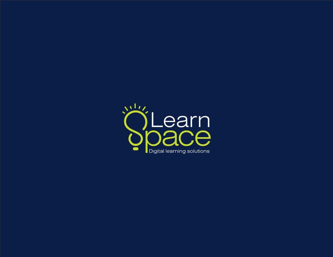
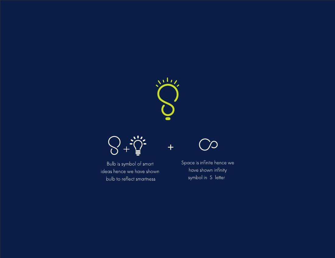
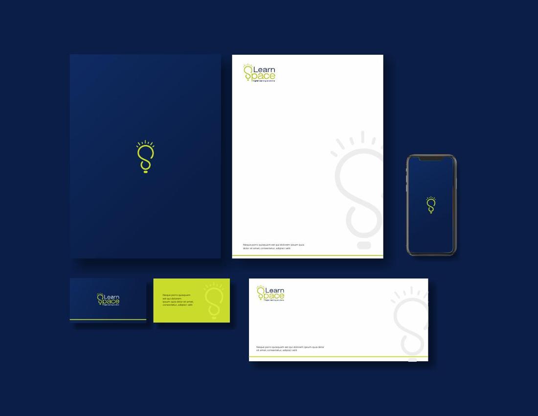
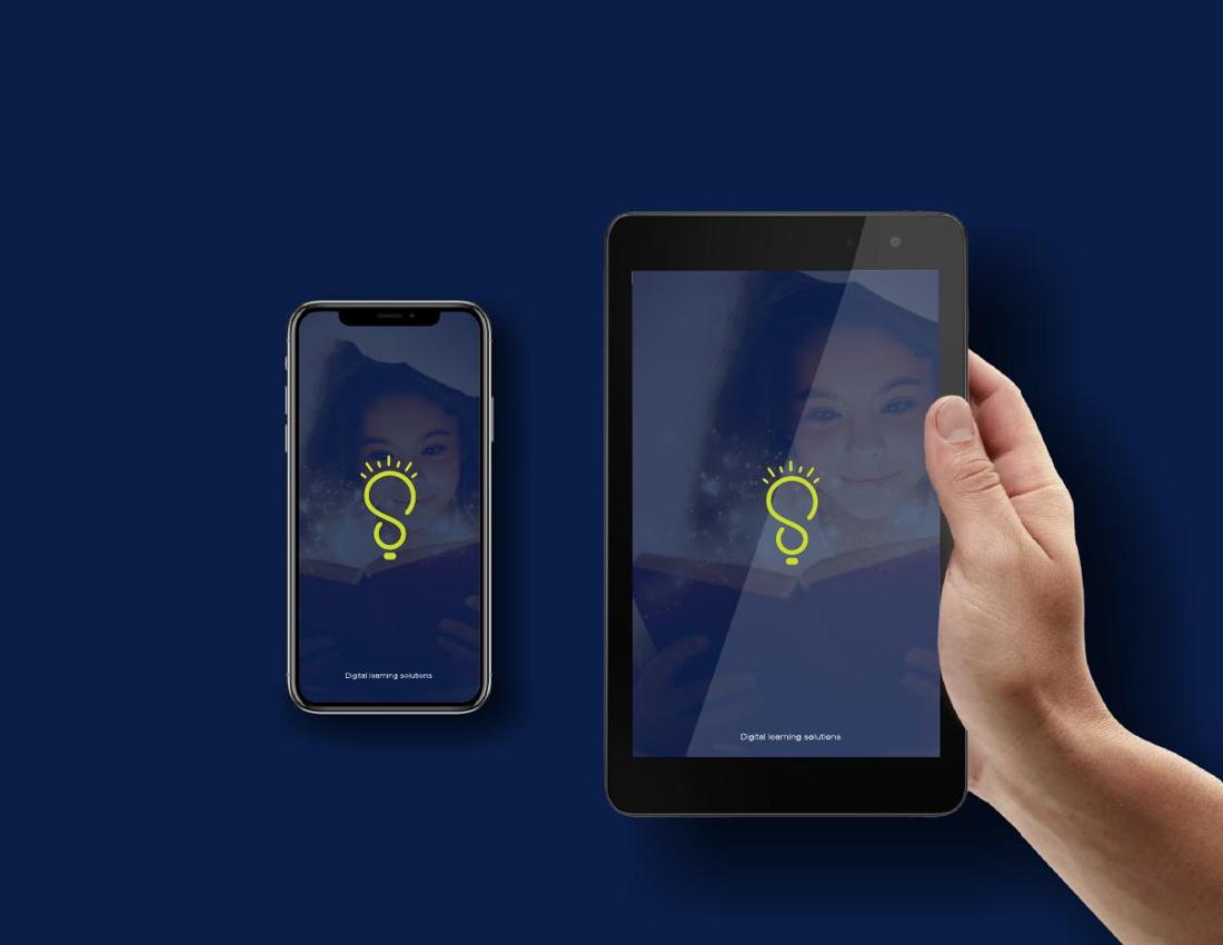
A light bulb drawn from the letter S — the moment an idea switches on. A navy and lime system for a digital learning brand across stationery, devices and screens.



Whether we are building a brand identity, designing packaging, creating an AI-powered video or planning a complete campaign, our purpose remains the same.
Start Your Project With TBW